
Name: office-ui-fabric-ios
Owner: Office Developer
Description: The front-end framework for building experiences for Office and Office 365.
Created: 2016-03-02 22:03:07.0
Updated: 2018-05-17 11:29:07.0
Pushed: 2017-05-08 19:46:45.0
Homepage: http://dev.office.com/fabric
Size: 315
Language: Swift
GitHub Committers
| User | Most Recent Commit | # Commits |
|---|
Other Committers
| User | Most Recent Commit | # Commits |
|---|
Fabric for iOS is a library that provides the Office UI experience for the native iOS platform. It contains tokens like Colors and Typography, as well as customization for native controls like the UIButton and UILabel (with more coming soon), all from the official design language used in Office and Office 365 products.
'OfficeUIFabricCore', '~> 0.1.6?
2.1. Download the latest changes from the Office UI Fabric iOS repository.
2.2. Move the OfficeUIFabricCore folder into your project folder.
2.3. Drag and drop OfficeUIFabricCore/OfficeUIFabricCore.xcodeproj into your xcode project.
2.4. Select in Xcode your project -> your target -> General -> Embedded Binaries -> add “OfficeUIFabricCore.framework”.
Import the library to use it:
rt OfficeUIFabricCore
You can use the UIColor extension to access colors from the Office color palette:
lor.msThemePrimary()
lor.msNeutralSecondaryAlt()
lor.msAccentBlueLight()
For the full list of colors, see the Styles page on the Fabric website.
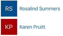
When you have a list of items that don't all have images (for example, address book contacts or a list of music bands), you can use the HashColor algorithm to generate random colors:
lor.msHashColor("Karen Pruitt")
lor.msHashColor("Norris Beardsley")
lor.msHashColor("Proseware, Inc.")
Fabric uses several font styles. You can see the full list on the Typography styles page of the Fabric website.
Fabric iOS uses Apple's SanFrancisco font.
Use the UIFont extension to get fonts for different styles:
nt.msFont(style: MSFontStyle.SU)
nt.msFont(style: MSFontStyle.XXL)
nt.msFont(style: MSFontStyle.SPlus)
The font returned will be the preferred font weight. You can also specify a different font weight:
nt.msFont(style: MSFontStyle.XL, weight: MSFontWeight.Light)
nt.msFont(style: MSFontStyle.MPlus, weight: MSFontWeight.Semibold)
nt.msFont(style: MSFontStyle.L, weight: MSFontWeight.Thin)
Note: The font weight works only for iOS 8.2 and later. For earlier versions of iOS, the font will be regular weight.
To be consistent with other design tokens, you can use recommended icon sizes with specific line weights:
ar Icons: 30x30pt, line weight: 1
bar Icons: 28x28pt, line weight: 1
gationBar Icons: 20x20pt, line weight: 1
In general, we recommend that you use outline icons rather than solid icons. Use solid icons for different icon states (such as following/not following).
You can use the UIButtonMS extension to customize your UI buttons:
.myButton.msStandardButton()
.myOtherButton.msPrimaryButton()
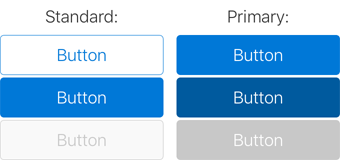
To customize the button color, you can pass parameters to msStandardButton or msPrimaryButton:
.standardButton.msStandardButton(UIColor.msAccentTeal(), disabledColor: UIColor.msAccentTealLight())

.primaryButton.msPrimaryButton(UIColor.msAccentTeal(), selectedColor: UIColor.msAccentTealDark(), disabledColor: UIColor.msAccentTealLight())
You can also apply a font and/or an image to your button in a standard way:
.toggleIconButton.titleLabel?.font = UIFont.msFont(MSFontStyle.L)

.toggleIconButton.setImage(UIImage(named: "MyToggleImage"), forState: .Normal)

.toggleIconButton.setImage(UIImage(named: "MyToggleImageSelected"), forState: .Selected)
You can use the UILabelMS extension to customize your UI labels:
.myLabel.msLabel(MSFontStyle.XL, fontWeight: MSFontWeight.SemiLight, textColor: UIColor.msThemePrimary())

.myBoldLabel.msLabel(fontWeight: MSFontWeight.Semibold)

.mySmallLabel.msLabel(MSFontStyle.XS)

.myColorLabel.msLabel(textColor: UIColor.msThemeSecondary())

.myColorSmallLabel.msLabel(MSFontStyle.XS, textColor: UIColor.msThemeSecondary())

You can use UITextFieldMSExtension to customize UITextFields in your project.
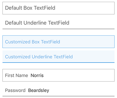
UITextField customization consist of three components:
You can use Box or Underline style for your text field:
.myTextField.msTextFieldBox()

.myTextField.msTextFieldBox(borderColor: UIColor, backgroundColor: UIColor, leftPadding: CGFloat)
or
.myTextField.msTextFieldUnderline()

.myTextField.msTextFieldUnderline(borderColor: UIColor, backgroundColor: UIColor, leftPadding: CGFloat)
To apply text style to your UITextField:
.myTextField.msTextFieldFontStyles()

.myTextField.msTextFieldFontStyles(style: MSFontStyle, textColor: UIColor)

.myTextField.msTextFieldFontStyles(style: MSFontStyle, fontWeight: MSFontWeight, textColor: UIColor)

.myTextField.msTextFieldFontStyles(font: UIFont?, textColor: UIColor)
You can use either “Placeholder text” in your UITextField or permanent “placeholder”:
laceholder text
.myTextField.msTextFieldPlaceholderText(text: String)

.myTextField.msTextFieldPlaceholderText(text: String, placeholderColor: UIColor, font: UIFont?)

ermanent placeholder
.myTextField.msTextFieldPermanentPlaceholderText(text: String)

.myTextField.msTextFieldPermanentPlaceholderText(text: String, placeholderColor: UIColor, font: UIFont?, padding: CGFloat)
Use the InitialsView component to create a colored box with initials from a string:
.initialsView.setInitialsFromTitle(title)
Use UIColor.msHashColor(title) to set the background color.
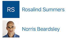
Use the LogoView component to create a colored box with initials or an image. This component contains InitialsView, UIImageView, and logic to show both of them based on input. Use this component when you have a list of items that don't all have images such as an address book.
.logoView.updateWithTitle(title)
or
.logoView.updateWithImage(image)
Post bug reports, feature requests, and questions on the issue tracker.
All files on the Office UI Fabric GitHub repository are subject to the MIT license. Please read the License file at the root of the project.
We use GitHub Releases to manage our releases, including the changelog between every release. You'll find a complete list of additions, fixes, and changes since the 1.0 release on the Releases page.
This project has adopted the Microsoft Open Source Code of Conduct. For more information see the Code of Conduct FAQ or contact opencode@microsoft.com with any additional questions or comments.