
Name: meteor-package-elements
Owner: ethereum
Description: null
Created: 2015-02-09 16:05:22.0
Updated: 2018-05-16 19:31:36.0
Pushed: 2018-05-16 19:31:35.0
Homepage: null
Size: 1473
Language: JavaScript
GitHub Committers
| User | Most Recent Commit | # Commits |
|---|
Other Committers
| User | Most Recent Commit | # Commits |
|---|
A collection of basic Meteor templates/components to make dapps faster to build.
Its recommended to use these elements along with the �app styles.
You can find a demo here.
$ meteor add ethereum:elements
The following elements can be use anywhere in your dapp.
Additionally this package exposes the following packages:
EthTools.TemplateVar.set()/.get() functions which can be used to get values from the select account, or address input element.Note that these packages will only be exposed to your client part of your dapp,
if you want to use e.g. EthTools on the server side add the package manually using $ meteor add ethereum:tools.

Shows an identicon.
You can add the class dapp-tiny, dapp-small, dapp-medium to make it smaller. Default size is to 64px.
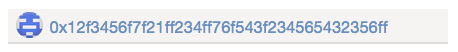
dapp_identicon identity='0x922a519ac926f69856fcfc1b2b8b846cfb3f6b4e' class="dapp-small"}}
Additionally you can provide a URL, which the identicon will link to.
dapp_identicon identity='0x922a519ac926f69856fcfc1b2b8b846cfb3f6b4e' link="/mypath/"}}
Creates a input field, with an identicon, which will change based on the input value.
You can add the class dapp-large to make it a larger input.
dapp_addressInput placeholder="0x000000.." value="0x1234..."}}
Setting size
By passing class="dapp-large" you can have a larger version of the input:
dapp_addressInput placeholder="0x000000.." class="dapp-large"}}
Additional Properties are:
autofocus="true"disabled="true"Getting values reactively
Getting the value using TemplateVar you can grap the templates reactive var using:
lateVar.getFrom('.my-container-element .dapp-address-input', 'value');
xe5f2f0a5ff3f889856c85b3a255501d1d291467d

r when used in an event
nge .dapp-address-input input': function(e) {
var value = TemplateVar.getFrom(e.currentTarget, 'value');
Note The value won't be set until the content of the input is valid.
Creates a textarea field, which only accepts HEX data as input.
You can add the class dapp-large to make it a larger input.
dapp_dataTextarea cols="20" rows="4" value="0x1234"}}
Setting size
By passing class="dapp-large" you can have a larger version of the input:
dapp_dataTextarea class="dapp-large"}}
Additional Properties are:
autofocus="true"disabled="true"Getting values reactively
Getting the value using TemplateVar you can grap the templates reactive var using:
lateVar.getFrom('.my-container-element .dapp-data-textarea', 'value');
x1bff2

r when used in an event
nge textarea.dapp-data-textarea': function(e) {
var value = TemplateVar.getFrom(e.currentTarget, 'value');
Note The value won't be set until the content of the textarea is valid.
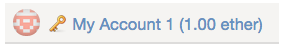
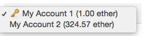
Creates a select, which can allow to select accounts. The provided array needs to have at least the follwing properties:
myAccounts = [

type: "account",
name: "My Account 1",
balance: "1000000000000000000", // in wei
address: "0x922a519ac926f69856fcfc1b2b8b846cfb3f6b4e"


name: "My Other Address",
balance: "324567543200000013456", // in wei
address: "0x1f93d965f60faee1085a93e99562945c1bd97be0"
tml
dapp_selectAccount accounts=myAccounts}}
This element works also well with the ethereum:accounts package, which provides you with EthAccounts.find().fetch() to get all current accounts.
Setting size
By passing class="dapp-large" you can have a larger version of the select box:
dapp_selectAccount accounts=myAccounts class="dapp-large"}}
Show icon
If you add the showAccountTypes=true property it will show a key unicode icon for all accounts with the type='account' property (set for EthAccounts accounts).
dapp_selectAccount accounts=myAccounts showAccountTypes=true}}
Getting values reactively
Getting the value using TemplateVar you can grap the templates reactive var using:
lateVar.getFrom('.my-container-element .dapp-select-account', 'value');

r when used in an event
nge .dapp-select-account select': function(e) {
var value = TemplateVar.getFrom(e.currentTarget, 'value');

This element allows you users to adjust the fee (gas * gas price) of a transaction, and gives you back either the gasInWei or the selected gasPrice.
You need to provide a gas estimation which you can get using e.g. web3.eth.estimateGas({from: .., to: .., data: ..}) or myContract.myMethod.estimateGas({from: ..})
and the tool will display whats the current medium gas price based on the given gasPrice * your gas usage estimation.
The user then can adjust the fee up and down by a factor of ~1.8.
Hint: To get the gas price reactivly you can use the ethereum:blocks package's EthBlocks.latest.gasPrice and pass it to the gasPrice property.
dapp_selectGasPrice gas=21000 gasPrice=50000000000 unit="ether"}}
Note: If you don't set the unit property it will use EthTools.getUnit(), like the {{> dapp_formatBalance}} element.
Getting values reactively
To get the gasInWei (gas * adjusted gas price) or the adjusted gasPrice use:
lateVar.getFrom('.my-container-element .dapp-select-gas-price', 'gasPrice');
56258440003" ~ 56 gwei

r the total fee when providing a estimated gas usage of 21000

lateVar.getFrom('.my-container-element .dapp-select-gas-price', 'gasInWei');
1181427240063000" which is "0.001181427240063" ether

r when used in an event
nge .dapp-select-gas-price input': function(e) {
var value = TemplateVar.getFrom(e.currentTarget, 'gasInWei');
Localization
The element can replace the - and + texts below the range selection using the tap:i18n package.
If the TAPi18n helper is available it will use TAPi18n.__('elements.selectGasPrice.high') and TAPi18n.__('elements.selectGasPrice.low') for the texts.
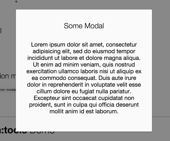
Just place a modal placeholder before the closing body tag.
dapp_modalPlaceholder}}
Render the modal:
lements.Modal.show("myContentTemplate");

r

lements.Modal.show({
mplate: "myContentTemplate",
ta: {
myData: "some data"
Additional options:
closeable - Prevents the default behaviour, which closes the modal when the overlay is clicked.class - A class, which will be add to the modal section elementlements.Modal.show("myContentTemplate", {
oseable: false,
ass: "my-modal-class"
Navigate to a path on close.
This will only work when the kadira:flow-router or iron:router package is installed:
lements.Modal.show("myContentTemplate", { closePath: "/dashboard" });
lements.Modal.hide();
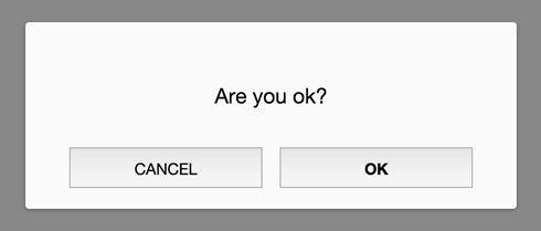
The question modal is a modal content template, which can be used to display a text and allow OK and Cancel options.
You basically just can pass a text, ok and/or cancel property as a data context to set callbacks, which will be fired when the button is pressed.
Additional you can:
ok or cancel property to true, it will just close the modal without any action.false or leave the ok or cancel property empty and it won't show that buttons.lements.Modal.question({
xt: "Do you want to ...",
: function() {
// do something on ok
ncel: true // simply show th cancel button and close the modal on click
Instead of passing a text you can also pass a template, which will be shown above the ok/cancel buttons
lements.Modal.question({
mplate: "myTemplate",
ta: {
my: "template data"

: function() {
// do something on ok

ncel: function() {
// do something on cancel
lements.Modal.hide();
Additional you can pass the same options as the modal as the second parameter:
lements.Modal.question(

text: "Alright?",
ok: function() {
  // do something on ok
}


closeable: false
The modal question can use the tap:i18n package for the ok and cancel button texts.
If the TAPi18n helper is available it will use TAPi18n.__('buttons.ok') and TAPi18n.__('buttons.cancel') for the buttons.